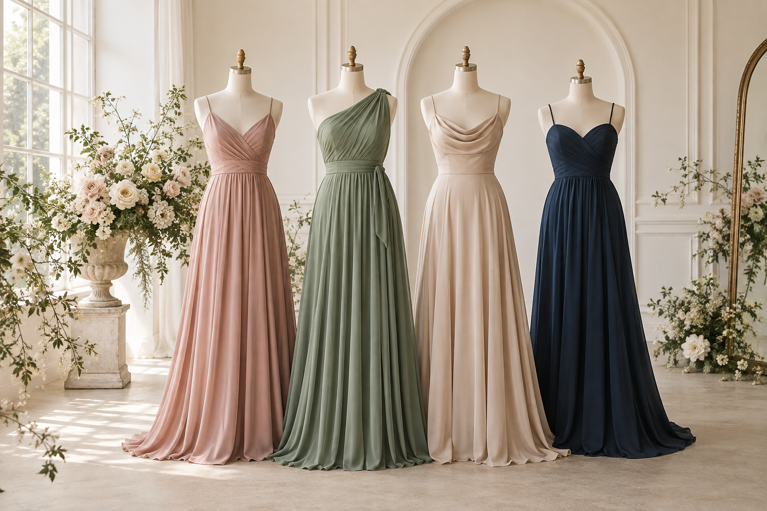
Choosing bridesmaid colors is about more than finding a shade that looks beautiful on a screen. The strongest palettes connect the venue, season, flowers and overall mood while still giving each member of the wedding party room to feel confident.
1. Begin with the feeling of the wedding
Before collecting color names, describe the celebration in three words. Romantic, airy and garden-inspired suggests a different palette from modern, dramatic and formal. Those words become a useful filter when two shades both seem possible.
Look at the venue's permanent colors too. Stone, wood, carpeting and wall color will appear in photographs alongside the dresses. A palette does not need to match the venue, but it should feel intentional in the space.
2. Choose one anchor color
An anchor color gives the wedding party a clear visual direction. It may be the exact dress color, the darkest shade in a tonal group, or a hue repeated in the flowers and stationery.
- Soft romance: dusty rose, mauve, champagne or misty blue.
- Natural elegance: sage, eucalyptus, taupe or warm neutrals.
- Classic formality: navy, burgundy, emerald or black.
- Fresh celebration: coral, lilac, blue-green or a controlled mix of pastels.
These are starting points, not rules. The best anchor is the color that supports the couple's vision and works in the actual setting.
3. Think in undertones, not just color names
Two dresses called “rose” can look completely different: one may lean peach, another mauve. Warm undertones usually pair naturally with ivory, gold and earthy florals; cool undertones often sit well with crisp white, silver and blue-based flowers.
If bridesmaids have varied complexions and hair colors, a family of related shades can be more flexible than one exact tone. Keeping the fabric or dress length consistent will help the group still feel unified.
4. Decide: matching or mix-and-match?
One color, different silhouettes
This is the easiest way to balance a cohesive look with individual fit preferences. Choose one fabric and color, then let each bridesmaid select an approved neckline or sleeve.
One color family, several tones
A tonal lineup can create depth in photographs. Limit the palette to three or four named shades and assign them in advance so the final group does not become accidentally uneven.
Different colors, one repeated element
For a more editorial look, repeat one feature across every dress—such as length, fabric, bouquet or accessory color. That repeated element becomes the visual thread.
5. Check the fabric in real light
Color changes with material and lighting. Chiffon appears soft and diffused, while satin reflects more light and can look brighter or deeper as it moves. Indoor warm light, direct sun and camera flash may all shift the same shade.
When possible, order fabric swatches and view them beside the floral plan in daylight and evening light. Photograph the swatches too; the camera view can reveal differences that are subtle in person.
6. Use the season as context, not a restriction
Seasonal color advice can be helpful, but it should not overrule the venue or the couple's style. Pastels can look sophisticated in winter with deeper accents, and rich jewel tones can work in summer when the fabric and silhouette feel light.
Comfort matters more than following a seasonal chart. Consider humidity, wind, temperature changes and how long the wedding party will be outdoors.
7. Make the final decision easy to follow
Once the palette is approved, share a simple reference with the wedding party:
- Exact approved color names and fabric.
- Required length and any neckline or sleeve guidelines.
- Approved mix-and-match combinations.
- Shoe and accessory direction.
- The date by which everyone should order.
A final palette checklist
- Does it support the wedding's mood?
- Does it work with the venue and flowers?
- Have you checked the actual fabric in more than one light?
- Will every bridesmaid understand the styling rules?
- Is there enough flexibility for different fit preferences?
Ready to explore the palette? Browse LYHIAS bridesmaid dresses, compare silhouettes, and use swatches to make the final color choice with confidence.